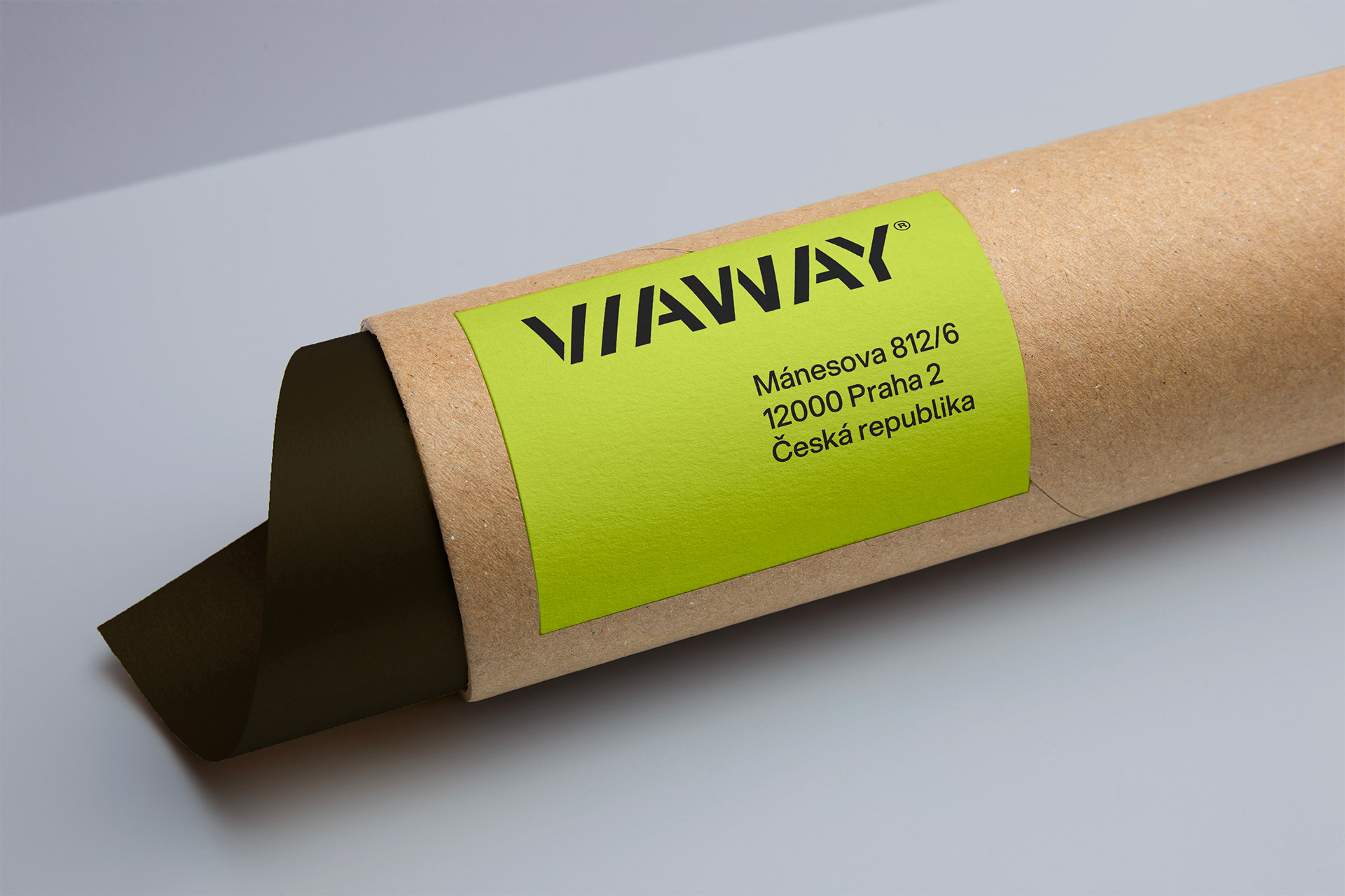
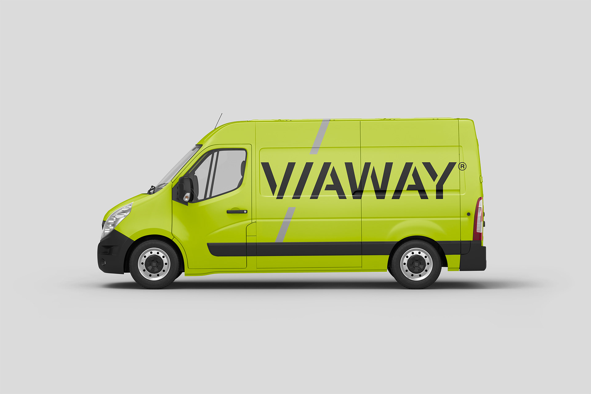
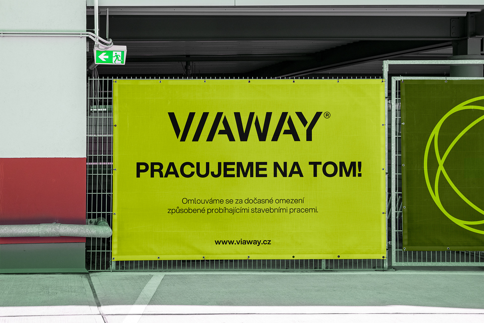
Viaway, a company specializing in transport infrastructure and signage, contacted me to create a visual identity that would reflect the technical nature of their work while remaining distinctive and highly functional across real-world applications. The logo concept was based on stencil typography, visual language historically associated with road markings, engineering, and industrial environments.
A subtle but defining detail was integrated into the wordmark itself. The letter “i” uses the same diagonal angle found in the letters “V” and “A,” creating a consistent geometric rhythm throughout the logotype. Together, these elements also suggest the abstract form of a road, reinforcing the connection to transport infrastructure in a minimal and understated way.